
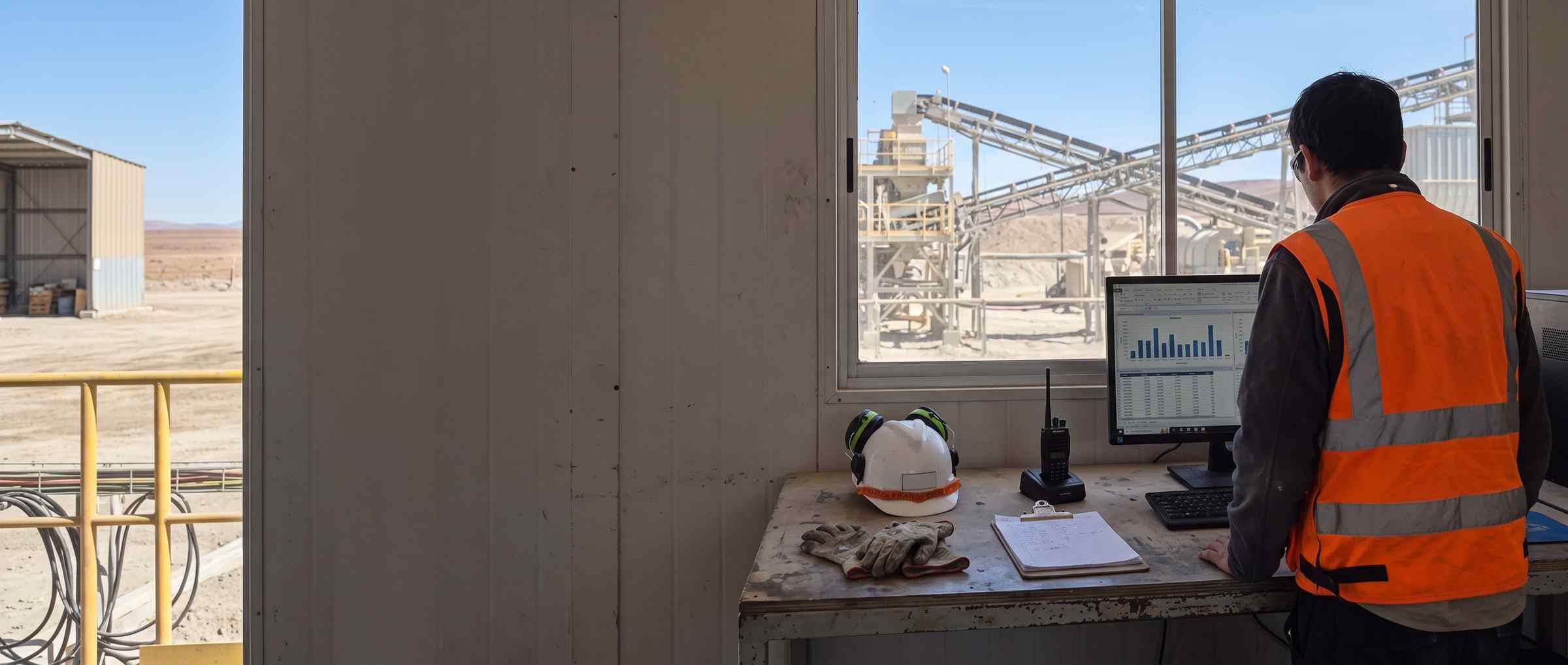
The question is not how many records there are. It is what changed since last month.
Every form filled in the field is already a row with its date, its author and its fields. What costs is the next question —what went up, where it concentrates— and today it is answered by dumping everything into a spreadsheet. PAIR answers it on the records it already has.
What it costs today to answer «how are we doing»
- The data is captured, but the answer is built by dumping everything into a spreadsheet and assembling a pivot table that has to be redone the following month.
- The comparison with the previous month is made with the current month half-way through: twelve days against thirty-one, and a drop shows up that nobody had.
- The report for management is built by pasting charts into a document, and when somebody asks where that number came from you have to go back to the spreadsheet.
Five things that change in the first month
- 01
The comparison against the previous period, with the incomplete period declared
- Today
- The area manager dumps the records into a spreadsheet the day they are asked for the number.
- With PAIR
- The two quantities and the difference in records, with the baseline cut to the same elapsed time and the warning that the period is half-way through. It compares against the previous one or against the same period last year.
- 02
The series by day, with the idle days inside
- Today
- The supervisor builds the series by hand, and the days with no records vanish from the chart.
- With PAIR
- One column per day of the chosen period, empty ones included, and the range is set by the period and not by the last data point. Separately, a grid of the last twelve months, built on every downloaded record and not on the filtered ones, saying which month the activity was in; records older than that window are counted and stated apart.
- 03
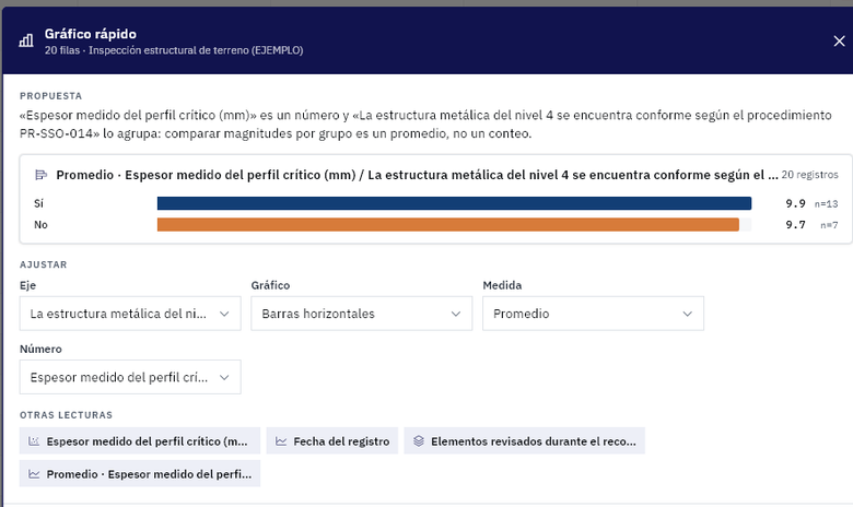
The chart from the table, without a single value leaving the browser
- Today
- Whoever reviews records copies the rows into a spreadsheet to chart them.
- With PAIR
- The proposal is decided by the data types and computed right there: no call to a model. It is saved as a specification and the dashboard redraws it.
- 04
The period report as a PDF, with what was left out stated
- Today
- Whoever signs it pastes the charts into a document, one by one.
- With PAIR
- The PDF with the chosen charts and, on request, the period’s forms attached up to a cap of thirty, with the number of those that did not make it written on the same screen.
- 05
The reserved field, which enters no aggregation
- Today
- Sensitive data travels in the spreadsheet with everything else, and nobody controls it.
- With PAIR
- The field out of every chart, average and prompt —also for the administrator who can read it record by record— and its name listed, instead of vanishing with no explanation.
What comes out of here
- Period report as a PDF, with the charts you choose and the written analysis
- Excel of records, one row per record
- Comparison against the previous period or against the same period last year
And many more, built around your operation. Ask us.

Demo
Bring us a month of your records
The form they already fill in and a month of data: in thirty minutes you see the figures, the series by day and the period report coming out as a PDF.
- Would you rather look at the plans first? See pricing.